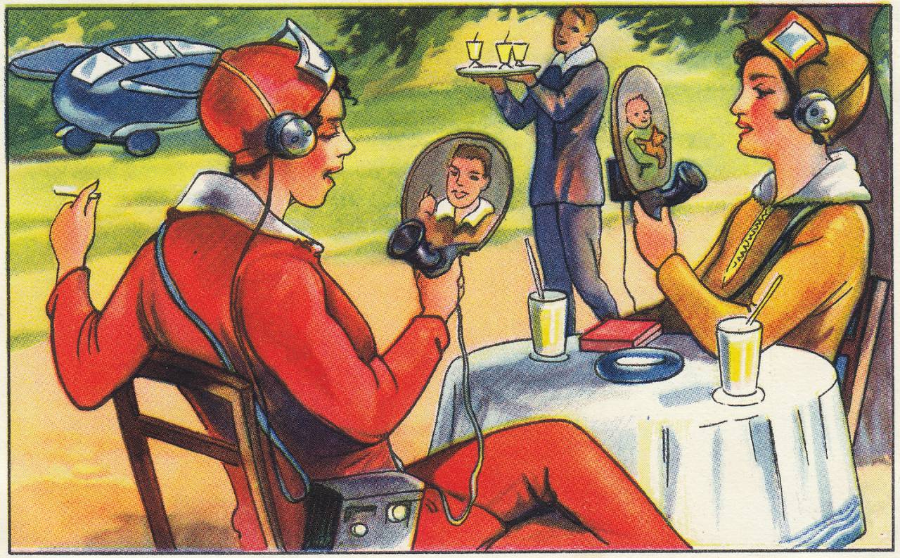
This is a card from an album released in 1930 by a German margarine company called Echte Wagner. The card and the album imagined what the world would look like in the far future. Every card came with some text accompanying it.
The text for this one reads:
“Wireless Private Phone and Television.
Everyone now has their own transmitter and receiver and can communicate with friends and relatives. But the television technology has also improved so much that people can speak to each other in real time. Transmitters and receivers are no longer bound to their location, but are always placed in a box of the size of a camera.”
– Wonderful Futuristic Visions of Germany By Artists In 1930 | Flashbak
This card is an example of retro-futurism, an art movement based on the tensions between the past and the present, on how the past imagines the future, and how the future looks back at the past.
In the 1930s, this card hoped for a future where we could all video-call each other while sipping margarine juice and smoking cigarettes. It got things right but only up to a certain point, as it also hoped that we would all have our own personal flying cars, which we clearly don’t, yet.
x-x-x
Given that we’re currently living in the future imagined by the german artists who made the cards in the 1930s, it’s fascinating to see the difference between their past expectations and our present reality.
A common theme in retro-futurism art is the hope for a utopia that would be fueled by technology. The 1930s were a ripe time for such work as the world was going through an economic depression and had just dealt with the First World War.
With technology developing rapidly, the most optimistic ideal of a future was a world where we lived in abundance with technology supporting our every need.
Examples of retro-futurism in popular culture
I remember coming across a movie called “Brazil” (1985) when I was a teenager.
This happened when people still carried physical hard drives with pirated movies collected over many trades. At that time, I didn’t really like “Brazil” at all. It felt a bit **too disturbing** and I only watched the first fifteen minutes or so.
The movie is about a dystopian future with many elements borrowed from the book “1984” by George Orwell. The visual style of “Brazil” is a really great example of retro-futurism – as it merged the visual language of the 1940s and the future as an extension of that visual language.
However, while “Brazil” might have gotten many things right in terms of ideology and philosophy, there were several things that it got wrong. For example, modern computers do not come with clunky typewriters.
Retro-futurism is also a massive influence on the aesthetics of George Lucas’s Star Wars. The visual style of the entire Star Wars universe merges our past with a future imagined in the 1970s.
Since the entire universe follows a single consistent visual style, the retro-futuristic influence has become a prominent part of the Star Wars universe, its effect clearly seen on the more recent additions to the franchise like “The Mandalorian.”
Read: On the importance of The Mandalorian, the history of Star Wars, and Disney | 22ndStreet
There’s also a lot of retro-futuristic art in automobile advertising and marketing. At one point or another, every company was trying to imagine the “vehicle of the future,” often with hilarious results that look nothing like the modern cars, except maybe for the Cybertruck.
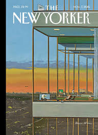
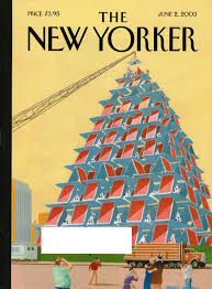
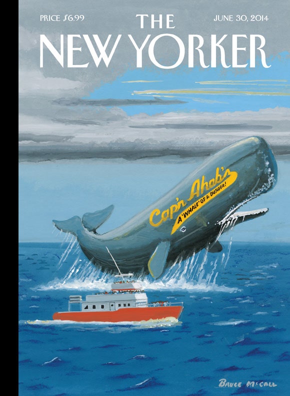
Bruce McCall, one of the most famous artists to dabble in retro-futurism, also got started in automobile advertising. However, eventually, he grew to hate it and started working in other fields. His covers for The New Yorker are considered some of the best artwork featured in the publication.
Bruce McCall and his “serious nonsense” art
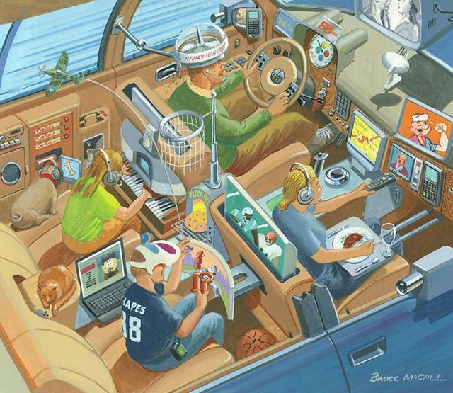
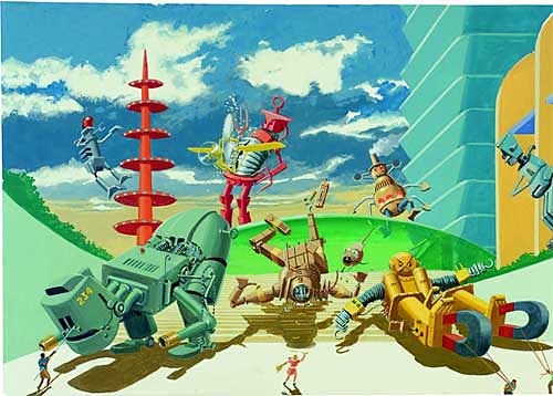

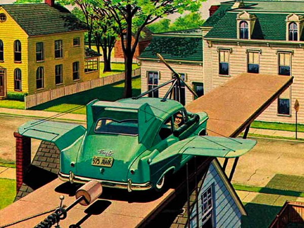
Bruce McCall is a Canadian artist and author who started his career “drawing cars for Ford Motor Company” in the 1950s.
He would work in advertising for decades and then shift towards more artistic pursuits – working for the National Lampoon and writing sketches for Saturday Night Live. He is also well known for his covers of The New Yorker.
In his TED talk “What is retro-futurism?“, he outlines the themes central to the majority of his work which he refers to as “serious nonsense”:
- Retro-futurism:
looking back to see how yesterday viewed tomorrow - Techno-archaeology:
digging back and finding past miracles that never happened - Faux-nostalgia:
achingly sentimental yearning for times that never happened - Hyperbolic overkill:
taking exaggeration to the absolute ultimate limit - Urban absurdism:
make life in New York look even weirder than it is
Weaving these themes together, he creates a world in his art that transcends time and culture, with images of a past that never was and of a future that never materialized.
It points out the absurdity of every generation. It demonstrates the human struggle between hoping for a better future backed by technological advancement and yearning for the “good old times” without technological interference.

Retro-futurism’s variations and central theme
“…nothing more than an aesthetic feedback loop recalling a lost belief in progress, the old images of the once radically new.”
Niklas Maak on retro-futurism
Broadly, we can categorize retro-futurism into two kinds – the future as seen from the past (retro-futurism) and the past as seen from the future (inverse retro-futurism.)
The first category refers to the scientific imagination of an earlier era, mostly from periods of time before the 1960s. In this category, visions of the future from the past are integrated into the actual future, contrasting the optimistic expectation with the often gloomy reality.
In the second category, the future looks back at the past and imagines what could have been if the past actually had access to the future technology. Imagine nuclear-powered submarines in the 1840s, and so on.
Both the categories are not confined to any period of time. Most retro-futuristic art is based on alternative timelines of the past and the future.
The central theme of retro-futurism seems to be dissatisfaction with the present. We urge for a better future or a more charming past, and most retro-futuristic art seems to be expressions of that theme.
Additionally, retro-futurism says a lot about technology and how it can improve our lives while at the same time making us unhappy. A lot of retro-futurism art also provides an alternative imagination of current technologies with values that are more in line with traditional human values.
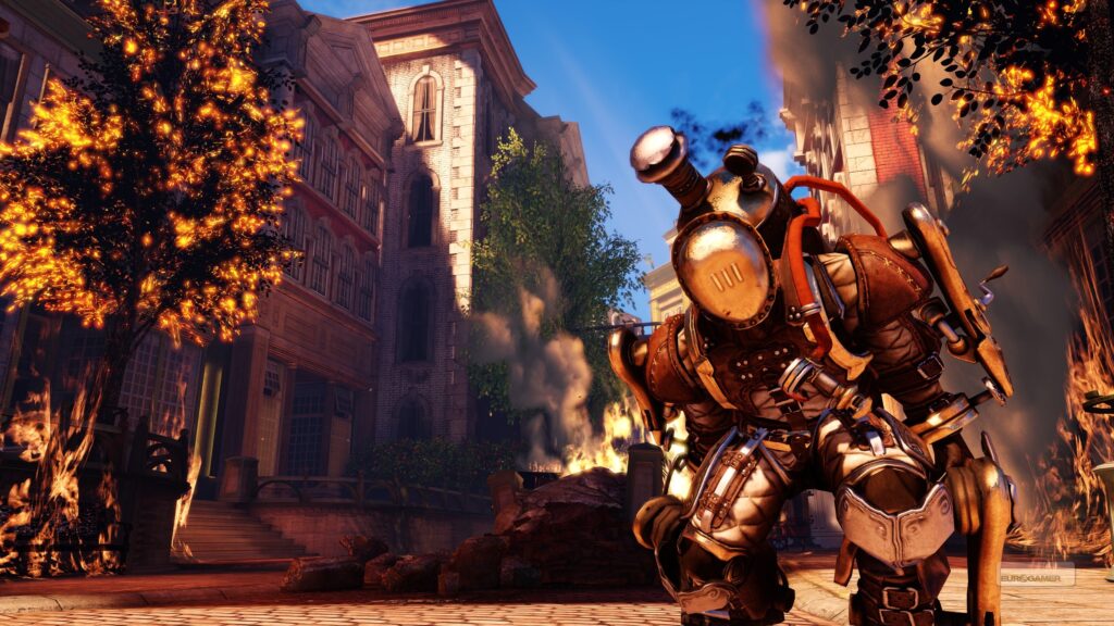
Retro-futurism would influence other styles like steampunk, where modern technology is injected retroactively into a Victorian-era world. One of the most popular examples of the steampunk genre is the massively successful video-game series “Bioshock.”
Politics and retro-futurism
In 2014, Fox News ran a segment in which they used an image that looked eerily similar to “Bioshock: Infinite”‘s logo. The segment’s topic was immigration and the logo was prominently displayed with the text “defending the homeland.”
The copyright infringement was not the real issue behind the conspiracy; it was the implications of using that image. The game is set in a floating city ruled by conservative religious crazy people who are highly racist. Its appearance on Fox News’ conservative segment on immigration felt like life was imitating art. It was also a case of irony since the game developer’s stance is very much the opposite of Fox News.
A bleak outlook on the politics of the future is not uncommon. For example, “Brazil” is about an Orwellian state controlling all aspects of society, and “Star Wars” is about an entire universe facing civil war and terror for decades. As mentioned earlier, retro-futurism’s core theme is the dissatisfaction arising from the present. This dissatisfaction transcends into political commentary and dystopian elements within the art format.
The golden age fallacy
The “golden age fallacy” refers to the idea of remembering only the positive elements of the past and ignore the negative elements, creating an illusion of a golden era where life seemed much better than it actually was.
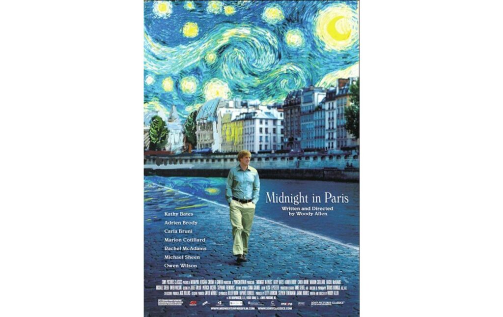
“Midnight in Paris” (2011) is one of my favorite movies, and its central theme is the idea of the golden age fallacy. The movie’s story concerns a writer who somehow manages to transport himself into Paris of the 1920s and meet his personal heroes like Ernest Hemingway and F. Scott Fitzgerald. The movie’s protagonist idolizes that time period, but he eventually discovers that people will always look into the past for a golden age to which they aspire to return.
For example, people who lived in the 1920s did not appreciate the present but looked to a past golden era in the 19th century. Hence, even when we live in the good old times, we will most likely not recognize it.
Naturally, a link exists between the golden age fallacy and retro-futurism as an art movement. Since we are destined to be always be disappointed with the present and look at a better time in the future or the past, the same artistic expression will always be a part of our popular culture.
Lastly, retro-futurism serves as a critique of how we are influenced by technology, what it can mean for us in the future, and what it could have meant if available in the past.
Buy me a beer! Or two… or ten.


